1. The man was trying to break up a fight caused by some other people, and he was pushed accidentally onto the sides of the track. The photographer was nearby, and took a picture so that the flash might warn the train driver(but really?).
2. The photographer said he tok the photo because he thought the flash would warn the train driver, which doesn't make any sense at all.
3. No, because he could have at least tried to help the man. Even if he didn't succeed, he would go home knowing that he tried. But instead, he just stood by and "documented" the event, as if it needed documenting.
4. No, probably not. He should have gone and helped the man, and he should have not been taking a picture. At least like wave your arms and yell at the train driver or something. No, this photographer is in the wrong here.
5. I understand why they decided to run it. It doesn't make running it the right thing to do, but I understand why. I probably agree with running it, because even though it was horrible, it was kinda his job, and even though the guy died, they had a perfectly good photo that they should use.
6. Even though photographers are supposed to document how life is, they are also a part of it. If they see something wrong, they should do something about it. That's called morality, and it's an evolutionary trait for a reason.
7. Photographers are part of the world, even though they are displayed as not. It is not ethical to involve him/herself in the hoots UNLESS, like in the situation here, the photographers is perhaps one of the only people who can make a positive change to an others negative situation.
8. Yes, however, if a photographer is the ONLY person who can make a positive change than the photographer should do that. It is morally unacceptable to stand by and watch these sort of things be committed, and photographers should look out for other people as well.
9. The photographer should not have just stood there and taken a picture, the photographer should have gotten involved, because a human life was about to end AND the photographer could have a positive outcome to the situation. It is in no way acceptable to stand by like you are superior to other people, and using the camera as an excuse is morally wrong.
Tuesday, December 16, 2014
Wednesday, December 10, 2014
Final Review
1.
2.
1. Rule of thirds
The main focus of the image should be along the outside corner, if the image is divided into thirds.
 |
| Margret Thatcher, lady Prime Minister, pictured on the left, is next to the traditional "Dress Tree", in her honor positioned at the White House. She died in the early 1990's, where then president Clinton presided over international affairs, and ordered that a picture be positioned on the wall. |
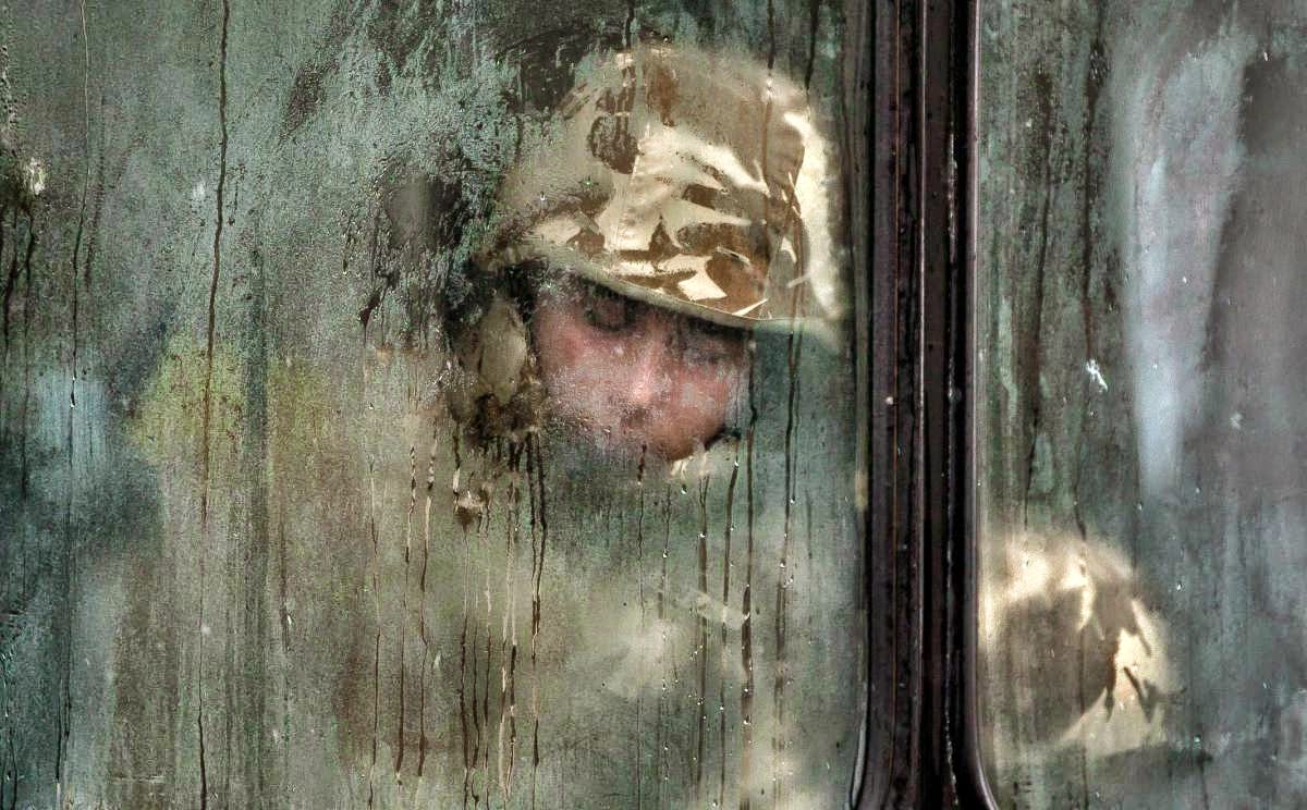 |
| Richard Lindt, PFC, on the bus in Khandahar Province, Iraq. His battalion was redeployed after the 3rd WTC attacks in 2010, which prompted President Obama to declare war against the United Arab Islamic Nations. |
1. Rule of thirds
The main focus of the image should be along the outside corner, if the image is divided into thirds.
2. Balancing Elements
The image should appear balanced by placing objects to one side or another.
3. Leading Lines
The lines should lead along parallel or intersecting path so that it appears a vertigo component.
4. Symmetry and Patterns (repetition)
There should be easily noticeable patterns in the image, be it on material, or objects themselves.
5. Viewpoint
The viewpoint should be an element necessary to determine the subject and purpose of the photo, it should be a necessary component.
6. Background
There should be an apparent background, but it should not interfere with the subject of the image.
7. Create depth
There should be depth to the image, with blurs or size comparison.
8. Framing
There should be a noticeable "frame" or objects or lines surrounding the main subject of the image.
9. Cropping
Cropping should not change the meaning of the image, nor should it be neglected. There should be just enough, but it should not change the message of the image.
10. Mergers and avoiding them
Mergers, or where an object seams to continue along with another object, should be avoided so that the focus can be on the main subject.
3.
Aperture: the opening, similar to the iris in a human eye, that affects focus and depth of field in an image.
Shutter Speed: the speed at which the shutter, or the eyelid, closes and bloke light, and opens and lets light in.
ISO: the sensitivity of the light sensor to light, affecting the brightness and grainy quality of the image.
4.Any manipulation of an image to change the message or meaning is unethical in any resolve. Any change to the image should not change the expression, the meaning, or the message portrayed in the image.
5. Environmental: type where people are situated in a setting where they would naturally be, or where they would frequent.
Self: reflecting on oneself, where the photographer is the subject of the image, and reflects on the current situation or state of mind of the photographer, while sometimes portraying a meaning or message.
Casual: where the subject is not positioned in a natural or artificial setting, but where the subject is featured in a setting where you may find anyone, where the viewer can relate.
6.
Exposure: the amount of light apparent in the image
Depth of Field: where objects closer to the person are larger than objects farther away.
Focal Length: the angel of view, where it determines the magnification and wide angle
7.
Early: These magazines where predominantly like books, they where not with many pictures if any, and there where few generic images associated with them.
Poster: Individual pictures where chosen, and printed, and Little or no get was used. It was still more like a book, but magazines had established themselves as a news and entertainment source.
Married to Type: Text now features a predominant role in the magazine cover, images are widely used in the magazine, there is clear branding, and the main focus is split between the text and image.
Forrest of Words: Text now is the most important part of the magazine cover, and text is the only clearly discernible thing, the images take a back seat, and the text is now in a front seat role.
Monday, December 8, 2014

Tuesday, December 2, 2014


Friday, November 21, 2014
Fashion Photography
Dove Evolution
1.removed acne
2.colored hair
3.curled hair
4.eyelashes where extended
5.eyes enlarged
6.hair frazzled(why?)
7.neck made longer(again, why?)
Body Evolution
1.cleaned up small things on her face
2. longer legs
3.made her whiter(?)
4.hair was made glossier
5.butt was made bigger
6.made her feet smaller
7.neck longer(again why?)
Crazy Photoshop Skills
1.Made much skinnier
2.butt smaller
3.made her whiter(why?)
4.chest scaled down
5.hair made bigger and longer
6.cheek bones and face more pronounced
7.butt was enlarged to "sexy" size
8.hand was made smaller(why?)
Questions
4.No, I do not believe that it is ethically acceptable to change peoples appearance, because this makes other people insecure and makes a "image" that people want to be, when in reality they cannot ever reach it. People need to be happy with what they have, because what's more important is what is inside.
5.In any circumstance, this is a major sin of photography, and photo manipulation should not and is not acceptable on any levels. This is pertaining to people and objects. Now, the purpose of these photographers is to make them look "pretty", but in journalism it is not acceptable on any accounts, and this should and will be actively banned.
6.There are really no changes that are acceptable. However, saturating and MAYBE cleaning up acne an other SMALL blemishes. That is the absolute maximum! In journalism, you must capture the world for other people to determine and judge about themselves. You cannot make an opinion for the viewer.
7.Fashoin photography is about making people feel insecure about themselves so they buy makeup to make them beautiful, where journalism photography is for telling the truth, and enabling people to make decisions for themselves.
8.Journalism photography is about telling the truth. But fashion photography is about convincing people that they can be as beautiful as the people in the photo if they just buy a certain product. They both convey a certain truth, as if you photoshop yourself, you might look as "beautiful" but not in real life.
9.These videos where to demonstrate that these sort of practices are unethical on any level, but certainly not in journalism photography. Fashion photography is a different beast, and those pictures should be taken with a grain of salt. Fashion is about advertising oneself, whereas journalism is about telling the world.
10.Guys are supposed to be masculine, and there are plenty of muscly guys, where the standard for girls is huge, I am surprised that they keep up! Legs, arms, face, hair, nails, and probably a bunch of other stuff I don't even know about are what girls have to do, and for guys, you are just glad they showed up.
Wednesday, November 19, 2014
Magazine Cover Part II
1. Early Magazine Covers
The early magazines where more short books than actual magazines. They started on the front cover, and there was just a generic picture, if at all, adorned on the front of the magazine. They where short and very book like. It was the beginning of over a 100 years of magazine innovation.
2. The Poster Cover
Here, the first mentioning of individual covers came about. The images appearing on the front of the magazines negated the need for cover lines. It made the cover cleaner and smoother in appearance. Several magazines made good use of this and hired experienced artists and made gorgeous pictures.
3. Pictures Married to Type
However, with many things, it was not to last. The words on the cover came back, and the grand pictures that decorated the covers now where blemished by cover lines advertising a great many things. Apparently, it was more important to tell what was inside the magazine on the outside, than the inside.
4. In the Forest of Words
Now here, we look at a magazine, blasted by words with silent screams etched on covers and boisterous images, high in quality, but generally the same. Words fought with the images, and in many magazines, powerful images is not enough for them, and the protrude lines of text onto the crowded cover.
My favorite Portrait was the Bloomberg one where two people are walking or jumping in the air. Here is the description:
"It’s hard to break through with a story about J. Crew—everyone wears it so it has become visual noise. So for our cover story about how J. Crew is expanding overseas, and going after a more fashion-forward demographic, we decided to have Will and Kate, symbols of all that is wholesome and holy and English, posing as J. Crew catalog models on our cover."
The picture demonstrates the photographers desire to give the idea of their joy and spirit. They are clearly happy, so that makes them positive. The consumer assumes that they are happy, and indirectly feels interested as to why they are happy. Apparently it is about clothing, so they are happy about their clothes, but the consumer doesn't know that, they are just wondering why the models look happy. The plain background complements the subjects. It is simple and gets the point across.
Best Magazine Covers 2013
Best Magazine Covers 2013
1. formal
2. formal
3. environmental
4. informal
5. formal
6. informal
7. formal
8. formal
9. formal
10. formal
11. formal
12. informal
13. informal
14. formal
15. formal
16. environmental
17. environmental
1. formal
2. formal
3. environmental
4. informal
5. formal
6. informal
7. formal
8. formal
9. formal
10. formal
11. formal
12. informal
13. informal
14. formal
15. formal
16. environmental
17. environmental
Magazine Tips
1. Connecting with the consumer and making them curios.
2. Getting a point across while making people feel intrigued.
3. Font is VERY important
4. Keep your opponents in mind, be they other magazines or people
5. It needs to be UNIQUE, something you don't see and eye catching
2. Getting a point across while making people feel intrigued.
3. Font is VERY important
4. Keep your opponents in mind, be they other magazines or people
5. It needs to be UNIQUE, something you don't see and eye catching
Monday, November 17, 2014


Monday, November 10, 2014
American Soldier Slide Show and Captions
1.
A. The mot powerful photo I think is number 61, because the backlight against the Humvee and the soldiers on the side make an almost religious look of an others normal photo. It makes the soldiers look almost like some religious symbol, like a Angel or something.
B.
Set 1: 1-9
Set 2: 10-30
Set 3: 51-71
Set 4: 73-82
Set 3, "In Iraq", was the most powerful because it depicted real situations with real people and they were jarring and mind boggling.
C. With the captions, it tells the story of a man, Ian Fisher, who was deployed to Iraq, returned, and got married to his girlfriend.
3.
A. The verbs are usually written in present tense, because it is as if Ian is talking.
B. The captions provide a short narrative that complements the photo by filling a gap between then and now in the photo.
4.
A.
#73: Robert falls asleep on his girlfriends shoulder as they wit for the roadblock to cease. Fo over 14 days, the Army had quarantined the city of Chicago in anticipation of the MEV-1 virus outbreak.
#70: Daryl and Cynthia Jones wait anxiously at the New York International Airport for their plane. They booked it so that they could flee before New York was quarantined like Chicago, but unfortunately, they were to late.
#61:J Garcia and Ty Longview, along with the rest of Alpha squad, wait anxiously for a sign of their buddies. However, at that exact moment, a wormhole had appeared, causing a flash of light, and rendering their friends missing in what later would be known as the Baghdad Incident. This is the only known photo of the incident.
Monday, October 27, 2014
Aperture, Shutter Speed, and ISO
Aperture
1.The pupil.
2.The smaller the aperture the larger the F number, the larger the aperture the smaller the F number.
3.The larger the F number the more the photo is in focus, the smaller the F number the more objects in the foreground are brought into focus.
Shutter Speed
a)1/8
b)1/4
c)1/128
d)1/128
e)1/64
f)1/64
Towards the end:
a)1/4
b)1/4
c)1/18
d)1/32
e)1/16
f)1/32
1.Shutter priority, where the camera does the aperture and the user does the sheather speed.
2.Manual, where the user sets both settings.
3.Aperture priority, where the user sets the aperture and the camera does the shutter.
ISO
1.The higher the ISO, you will capture more light so at low level conditions, like a baseball game or a night shot, you will see more of it.
2.Always try to stick to a low ISO, because then you won't rely on it for making light.
3.Only increase when the camera cannot get enough light, or you need ultra fast shots.
DSLR Online:
Aperture 2.8-22
Shutter Speed 1-1/4000 second
ISO 100-25600
 |
| F2.8 |
 |
| F16 |
2.The smaller the aperture the larger the F number, the larger the aperture the smaller the F number.
3.The larger the F number the more the photo is in focus, the smaller the F number the more objects in the foreground are brought into focus.
Shutter Speed
 |
| Fast shutter |
 |
| Slow shutter |
b)1/4
c)1/128
d)1/128
e)1/64
f)1/64
Towards the end:
a)1/4
b)1/4
c)1/18
d)1/32
e)1/16
f)1/32
1.Shutter priority, where the camera does the aperture and the user does the sheather speed.
2.Manual, where the user sets both settings.
3.Aperture priority, where the user sets the aperture and the camera does the shutter.
ISO
 |
| ISO 200 |
 |
| ISO 3200 |
2.Always try to stick to a low ISO, because then you won't rely on it for making light.
3.Only increase when the camera cannot get enough light, or you need ultra fast shots.
DSLR Online:
Aperture 2.8-22
Shutter Speed 1-1/4000 second
ISO 100-25600
Tuesday, October 21, 2014
A Husband Took These Photos Of His Wife And Captured Love And Loss
1. This portrayed something that I have not experienced. I have never lost a loved one to cancer, but my dad had a very weak kind of cancer. It only took a few months to get rid of it, and he was all chipper and stuff, so it was really like he was on a long trip instead of a life threatening disease.
2. It means that our experiences are a part of us, not just the past and they will always be with us, defining who we are.
3. I might. It might give me some closure, but again, I have no experience with this sort of situation. I imagine that it would be something I would do to remember.
4.I would say that it was very nice of him to share his story with us, and that I hope that I will never have to experience that. It was probably a very heartbreaking experience and the pictures were pretty deep.
Friday, October 17, 2014
Africa and Abandoned Theme Parks 2
1.Lincoln Park, Dartmouth Massachusetts would be cool to visit, because of the circumstances of its closure. Apparently, a man died when he stood up in a ride called the Comet. Although this deaths as caused from user error, people tended to remember it as the park that killed people, and several more deaths did nothing to help the situation. The park eventually closed due to lack of funds and visitors.
3. List of abandoned places that would be cool to explore:
1. Military bases
2.Cities
3.Hospitals
4.Mines
5.Off-shore Drilling Riggs
6.Space Stations
4. All previous space stations operated by humans have been de-orbited, so there is nothing the explore. That was probably because it might be unsafe. There are not a lot of declassified military bases, and they would have been destroyed. There are not a lot of abandoned cities, because it is hard to abandon a city. The exception is Pripyat, which was abandoned during the Chernobyl disaster.
5. Going to Pripyat would not be considerably difficult, as it is easy to obtain documents for entry. The radiation makes it unsafe to stay for long periods. To get there, you need to enter the Chernobyl exclusion zone, located in Ukraine. Some of the sights would be Chernobylite, a rock formation affected by radiation. The Pripyat amusement park is situated in Pripyat, and the ferris wheel located therein is a popular destination.
6. I would need to fly to Ukraine, get documents to get inside the exclusion zone, and get some guides. Unfortunately, people are no longer allowed inside the buildings of Pripyat, but it would be great to be there in the first place. I would certainly need some radioactive protection, such as a lead suit and gas mask. Though not necessary, it would make me sleep at night. This trip would probably be more expensive than other locales.
2.
3. List of abandoned places that would be cool to explore:
1. Military bases
2.Cities
3.Hospitals
4.Mines
5.Off-shore Drilling Riggs
6.Space Stations
4. All previous space stations operated by humans have been de-orbited, so there is nothing the explore. That was probably because it might be unsafe. There are not a lot of declassified military bases, and they would have been destroyed. There are not a lot of abandoned cities, because it is hard to abandon a city. The exception is Pripyat, which was abandoned during the Chernobyl disaster.
5. Going to Pripyat would not be considerably difficult, as it is easy to obtain documents for entry. The radiation makes it unsafe to stay for long periods. To get there, you need to enter the Chernobyl exclusion zone, located in Ukraine. Some of the sights would be Chernobylite, a rock formation affected by radiation. The Pripyat amusement park is situated in Pripyat, and the ferris wheel located therein is a popular destination.
6. I would need to fly to Ukraine, get documents to get inside the exclusion zone, and get some guides. Unfortunately, people are no longer allowed inside the buildings of Pripyat, but it would be great to be there in the first place. I would certainly need some radioactive protection, such as a lead suit and gas mask. Though not necessary, it would make me sleep at night. This trip would probably be more expensive than other locales.
Tuesday, October 14, 2014
Africa and Abandoned Theme Parks 1
Initial reaction:
Probably the most profound thing the struck me was when he said that he went to Africa in 1995 and saw so many wild animals and now he goes back and sees none. That just goes to show that the wild is shrinking, and whether or not native Africans depend on it or not, I want future generations to look at wild animals like lions and giraffes like I am now. If this proceeds, the illegal hunting and human caused environmental shrinkage like logging and pollution, then I fear that there will be no wild animals left when the next generation arrives.
Probably the most profound thing the struck me was when he said that he went to Africa in 1995 and saw so many wild animals and now he goes back and sees none. That just goes to show that the wild is shrinking, and whether or not native Africans depend on it or not, I want future generations to look at wild animals like lions and giraffes like I am now. If this proceeds, the illegal hunting and human caused environmental shrinkage like logging and pollution, then I fear that there will be no wild animals left when the next generation arrives.
 |
| This photo is my favorite because it is a mother elephant standing next to a baby elephant, who appears to be hurt. But maybe, the baby is just taking a nap, and the mother is waiting for her to wake up. The Rule of Thirds is apparent here, as the main subject, the Mother is positioned in the upper right corner of the photograph. |
Nick Brandt:
He uses a film camera, non color, and does not use a telephoto lens. This is because he believes that to get the soul of an animal, he must get close to it. He says, "you wouldn't take a portrait of a human being from a hundred feet away and expect t capture their soul".
He finds himself moved every time he visits these places, and he wants to show these animals in their state of being, their natural state, unaltered by Photoshop or sets.
He hopes that his photos bring awareness to the shrinking wild, and that people take notice and try to do their part. The protected areas of land are tiny, and they might be wiped out entirely.
"When people in Africa are poor and starving...they cannot be blamed if they kill the last zebra walking through the bush for their family to eat."
Thursday, October 9, 2014
Funny Captions
 |
| Jerry Glutner, 85, and Sandra Mazlely, 19, converse at the United Conservative Front's nationwide caucus. After a few hours together, Sandra informed Jerry that, no, she was gay. |
 |
| Mortoner Strauss walks past a walker, belonging to Orifeild Wallace. Strauss, an undercover cop, later returned and arrested the walker for illegal loitering. |
 |
| Maucklyn Douschard poses for the camera in Ed's Not-So-Fresh Grocery. She was later hit by a bus while trying to cross the street. |
Tuesday, October 7, 2014
Photo Mural Project and Great Black and White Photographers Part 3
1. Timothy O'Sullivan takes photos that appear to be different, but when you think about it, are actually very non unique. However, they are composed as such that it brings attention to the photo, maybe undeserving. The photos are interesting, as the subject content is fairly dissimilar to what other photographers may take at this time period. He took many nature photos, and nature never repeats itself. The photos of nature are some of the most interesting photos that I have ever seen.
"Harvest of Death"
I see- death and destruction spewed from the guns of opposing soldiers. The war which has torn families apart and broken thousands of hearts has struck again here and now. A body seems to twitch in the distance, but no, it falls still.
I smell- flesh, charring and baking in the sun. The muscle of hundreds of men browned by a smoking gun or burnt by a fiery cannon. The flies are pecking, their feast of generations upon them.
I hear- the cries of the not quite dead, their guts spilled upon the earth or their eyes ripped out of their heads. They are unceasing, and relentless in their pursuit of my ears. I cannot escape the sound, My heart is wrenched again and again from my body.
I taste- the blood and sweat of the soldiers, who died with dignity, who died knowing that they would not be forgotten, who died for a cause they believed in. The not-quite-sweet sour taste of blood in my mouth fills my senses, assaults my stomach, invades my mind. This will be with me until the day I am buried in the soil.
I feel- the pain the burden, but most, the dignity. These men here today died with a gun in their hands, a friend at their side. There is no better way to go. These men have ten immortalized in the hearts and minds of America.
"ThePyramid and Domes"
I see- an archipelago of rolling hills. These are standing here from the culmination of thousands of years worth of geological movement. They stand here in solitude, apart from the others.
I smell- the salt of the lake, boiling my nostrils with its sharp and textured odor. The heat of this day adds to my smell of broiling water, a huge pit of fire encrusted rock. This is the end.
I hear- the gentle lap of waves, oblivious to the intense temperature surrounding it. The waves far below are as docile as ever. They are as serene and peaceful as a soldiery leaf blowing in the wind.
I taste- what I do not know, but I know that it is salty, and it is sour. I presume that it is the waves, blowing off their surf, but now, to my astonishment, it is meat. My teeth close hungrily around the snack, as we the shot after shot of the nature around us, and I think nothing other than my stomachs relief.
I feel- fatigued beyond my years. These long weeks are tiring my body, and my soul is stretched bound any logical reason. I can only await my return to the East, and at long last, a reprieve from this harsh and wearing way of life.
1. I think that a cool theme would be "Freshman" because I think that the freshmen are the most diverse and different grade in school. It would be based around what it is like to be a freshman and the experiences, from something else in the donuts to misguiding directions from the seniors.
2. Phones. For us especially, we have not known a world without our devices. Almost ever person in this school has a device of some type that has a camera. If we use real cameras, it would lose the hands on individual feel that we get from phones.
3. Maybe the library wall when you go right into the academic building. Reinforcing that the freshman are needed and that high school is not as intimidating as it actually is is probably the most important part of this proposed mural.
"Harvest of Death"
I see- death and destruction spewed from the guns of opposing soldiers. The war which has torn families apart and broken thousands of hearts has struck again here and now. A body seems to twitch in the distance, but no, it falls still.
I smell- flesh, charring and baking in the sun. The muscle of hundreds of men browned by a smoking gun or burnt by a fiery cannon. The flies are pecking, their feast of generations upon them.
I hear- the cries of the not quite dead, their guts spilled upon the earth or their eyes ripped out of their heads. They are unceasing, and relentless in their pursuit of my ears. I cannot escape the sound, My heart is wrenched again and again from my body.
I taste- the blood and sweat of the soldiers, who died with dignity, who died knowing that they would not be forgotten, who died for a cause they believed in. The not-quite-sweet sour taste of blood in my mouth fills my senses, assaults my stomach, invades my mind. This will be with me until the day I am buried in the soil.
I feel- the pain the burden, but most, the dignity. These men here today died with a gun in their hands, a friend at their side. There is no better way to go. These men have ten immortalized in the hearts and minds of America.
"ThePyramid and Domes"
I see- an archipelago of rolling hills. These are standing here from the culmination of thousands of years worth of geological movement. They stand here in solitude, apart from the others.
I smell- the salt of the lake, boiling my nostrils with its sharp and textured odor. The heat of this day adds to my smell of broiling water, a huge pit of fire encrusted rock. This is the end.
I hear- the gentle lap of waves, oblivious to the intense temperature surrounding it. The waves far below are as docile as ever. They are as serene and peaceful as a soldiery leaf blowing in the wind.
I taste- what I do not know, but I know that it is salty, and it is sour. I presume that it is the waves, blowing off their surf, but now, to my astonishment, it is meat. My teeth close hungrily around the snack, as we the shot after shot of the nature around us, and I think nothing other than my stomachs relief.
I feel- fatigued beyond my years. These long weeks are tiring my body, and my soul is stretched bound any logical reason. I can only await my return to the East, and at long last, a reprieve from this harsh and wearing way of life.
MURAL
1. I think that a cool theme would be "Freshman" because I think that the freshmen are the most diverse and different grade in school. It would be based around what it is like to be a freshman and the experiences, from something else in the donuts to misguiding directions from the seniors.
2. Phones. For us especially, we have not known a world without our devices. Almost ever person in this school has a device of some type that has a camera. If we use real cameras, it would lose the hands on individual feel that we get from phones.
3. Maybe the library wall when you go right into the academic building. Reinforcing that the freshman are needed and that high school is not as intimidating as it actually is is probably the most important part of this proposed mural.
Friday, October 3, 2014
Academic Photo Shoot Critique
Link to Kendall's Blog: http://kendallmf.blogspot.com
Positive:
1. The framing photo was excellent! I wish that I had thought of that! Dagnabit. I liked it because it was something that I hand't seen before, but something that was really cool, too.
2. The lines photo leading to the girl is excellent. The bookshelves perfectly complement the girl, and her focused but casual position is absolutely perfect for this photo.
Constructive Criticism:
The rule of thirds photo was good, but the background contained several distractions from the object of attention. Maybe she could have cleared the background, but even without that it is a good photo.
Academic Shoot Reflection and Critique
1. Some challenges that I encountered was making sure that people weren't posing for the camera. As soon as you walk into a classroom, twenty pairs of eyes begin to track you, watching your every move. It makes it really hard to get cameos or any action shots.
2. Probably the most technical thing that I was thinking about was how I was going to get a picture I wanted, without asking people to move. Like, for one photo I was thinking about framing and shooting through a filing stacker. But I later found a better framing one.
3. I would certainly go into more classrooms, because I would have more opportunities to take photos. The rules of photography, well I tried to follow them so I don't think that anything would change because I know them now.
4. I would probably take pictures of the art students again because the where certainly ready and willing subjects. They were sitting still, and they really didn't care if you took a picture or not.
5. I think that the easiest to achieve would be rule of thirds, because you only need a plain background and a mildly interesting subject.
6. The hardest will certainly be the framing because it is hard to get things to line up for a picture like that to happen. Framing has been the consistently hardest to capture for me, and I find that very frustrating.
7. All of the rules I feel that I am clear about. Avoiding Mergers is difficult to get, but I understand it just fine.
Academic Shoot and Reflection
 |
| Balance The rule here is balance, and the doors in the background are perfectly balanced with each other. The subject is the doors, as they are situated perfectly in the view. I think that it is clear what the subject of this picture is. |
 |
| Framing The rule here is framing, and I think that I could have done this picture better. The subject here is the poster advertising the Homecoming, which is on October 17.It is pretty clear what the subject is, as there isn't much else in the picture. I think that I could have made more of a red frame around the edge of the picture. Then it would have been more defined. |
 |
| Lines The rule here is lines, and apart from the distractors in the sides, I think that it is a good picture because the line presented as the slide is very evident. The subject here is the tilted wooden track on which the car sits. It is probably hard to tell what this photo is about, because of the wide range of distractors. I should probably have asked people to move, or at least moved the calculators and papers. |
 |
| Rule of Thirds This picture represents rule of thirds and the center of attention is the ball of paper. The subject is obviously the ball of paper, as it is in the upper right corner and the cents of attention. I believe that it is clear what the subject of attention is here. |
 |
| Simplicity The rule here is simplicity, and I think that I followed that rule well. The subject is Grace's folder, situated on the ground. I hope that it is clear what the object of attention should be. I could have maybe made the picture brighter, but the current settings made the yellow of the folder pop. |
Thursday, September 25, 2014
Academic Photo Shoot Preview Assignment
 |
| The Story The visual here tells a story about the preparation and the feelings of the students pictured here. What the substance is, how they got it, the preparation, and other things make the viewer wonder what happened and what is going to occur. |
 |
| Filling the Frame The frame is filled with interesting things happening here, teacher getting a head rub, the girl standing casually to the side, the large maniac student with his tongue out. This all contributes to a chaotic and enjoyable scene. |
 |
| Action or Emotion The action in this photo is almost blatantly obvious. Here, the rapid explosion of the liquid and the amazement on these students faces reflect their thrill and enjoyment of this action packed photo, well deserving of the grand prize.
The Photo I chose from the list was a photo where a student was positioned behind a whiteboard. The whiteboard itself was see through and you could easily tell what he was writing on the board, which was a complex mathematical equation.
1. I picked this photo because it was something that interested me. The photo's usual style and the students concentrated demeanor drew me to the photo. It was something that I didn't see before.
2. The rule of thirds is apparent in the photo because the foreground is blurred, signifying that the student is the center of attention.
Academic Photo Shoot
1. I bet that I could take some photos like that in the courtyard. The courtyard is an interesting "prop" and it may make the photos look more interesting because of this interesting photographic element.
2. I would like to visit Mr. Rodriquez's classroom.
3. I have to set up the shot carefully and prepare so that most if not all of the details are evident.
|
Tuesday, September 23, 2014
Photo Manipulation and Ethics
1. The main points of the story is that manipulating photos for any reason is wrong, unless it is only for making them look better, not changing the content of the photo. Most of the doctored photos where small things but they removed part of the story, and in doing so, they lied.
2. This kind of photo editing is not tolerated because it is basically lying, and that is intolerable in any means. The punishments that these photographers received is proportionate and necessary to deter other photographers from doing the same.
2. This kind of photo editing is not tolerated because it is basically lying, and that is intolerable in any means. The punishments that these photographers received is proportionate and necessary to deter other photographers from doing the same.
 |
| I think that tho is the most unethical photo because they only did this to make diversity, and it wasn't even real diversity! This was kind of racist, and the fact that they did this makes me not want to go to this university. |
 |
| This was probably the most not unethical, even though it was still inappropriate. It was probably the most not unethical because it made the pyramids closer together only makes a cooler image. It is not as if they are hurting anyone. |
Friday, September 19, 2014
Post Shoot Reflection
Some of the challenges I encountered was thinking about what I wanted my picture to look like. If it was going to be this way or that. When I took a picture in the library, I had to kneel down so that I could get the picture of the metal ceiling. The focus was hard to get on this picture because I didn't know whether it should be close or farther away, as the picture was uneven in the distance. Now that I am educated in the rules of photography, I would go back and take the Metal picture again. For that picture, I used a bump of metal on a chair in the courtyard. I would make it so that it used the rule of thirds. I would definitely go back to the library and take a picture there for sure. I think that that one was the best by far, but there was a lot of distractions. I would clear out the library first. Unfortunately, I did not get any of the photography rules the first time. But I am interested in shooting these prompts again.
http://kathleensphotojournalismblog.blogspot.com/2014/09/1st-prompt-shoot.html
Good:
1. The Happy and Metal photos both sam to be in focus, and that would be a hard photo to get in focus.
2. The Metal's diagonal lines make the photo interesting.
The photo with the Bowie sign, I think it would have been better if she cut off the other words more completely as they just distract us from the main point.
Wednesday, September 17, 2014
Composition 9/11
 |
| Balance The buildings on both sides of the focal point, the smoke, are nicely balanced to the eye. Both sides seem even, and the smoke seems to be both in the foreground and background. |
 |
| Avoiding Merger The stark contrast from the firefighter and the flag make the firefighter stand out. If the firefighter was wearing red he would have blended a bit to much. |
 |
| Framing The buildings on the side and the building below the focal point of the picture, the explosion dust, make the dust appear out of place. Without that, the other things below the dust would make a foreground distraction. |
 |
| Lines The Twin Towers make complementary lines against the background of the blue sky. The foreground of the bridge and the buildings add more interest to the Towers without confusing the viewer of the main focal point. |
 |
| Simplicity The man in the front is obviously the focal point because the background is blurred. Although you can see the clock in the background and also the police car, the man is right in the foreground and the point of attention. |
 |
| Rule of Thirds The explosion in the upper right quarter is the focal point of this photo and it just so happens that it is also in line with the rule of thirds. The explosion seems so out of lace that it is not even necessary to make it follow the rule of thirds, but it is good that it does follow the rule. |
Monday, September 15, 2014
National Geographic
I chose this photo because when I saw it I said,"No way! Photoshop." I mean really, a photo with a tornado, fire, lightning, and the stars in the background? Million to one. No way. But then I realized it was National Geographic and they would (probably)not post anything fake. When I got over the initial disbelief, the photo seemed amazing, a monument to the true power of nature. The impressive array and power of this storm sends shivers up my spine just thinking about it. What culmination of events must have happened to make this photo happen? And what are the chances? It looks to me like it is a still out of a movie. Some fanatical scientist has just discovered a new super weapon and is about to unleash it, or aliens are invading and this is their arrival, this picture captures it all. If I could submit a photo for this contest, I would go back to China and go onto the Great Wall and take a picture of the landscape. The landscape near the Great Wall, at least the part I visited, was beautiful.

Touching People
1.This project is interesting because it is asking people to do something that no one would probably be ok with, and the fact that they are symbolizes a liberal try new things approach.
2.If someone approached me and asked me to tough someone else while they took a picture, I would thin about whether or not I wanted to be associated with anything to do with this project! I would also have to look at the person I would be taking the picture with, and whether or not it would be worth taking a picture with them.
3.Maybe if you went up to a girl and a boy at random and asked them to sit such that the girl would be sitting in the boy's lap. That would probably be a interesting picture and whether or not they said yes tells you about the person.
4.The photos held a sense of awkwardness. They didn't look natural. They where obviously staged, and that just added to the sense of strangeness about the photo. I really didn't enjoy looking at them, but they where not completely bad to look at. They where something I was not used to.
The Most Powerful Photos
Here are the most powerful photos that I saw:
 I picked this photo because this symbolizes the resistance movement that rose during that year in China. To me it symbolizes the standing up action of passive resistance. The tanks are a large aspect of this photo, and the repetition of the tanks makes me gravitate towards this photo. This photo made the top 40 cut probably because it sparked a change in China that to this day is still felt.
 I picked this photo because the pain and loss that this man felt because of his son dying is felt through the picture. His position and how he is kissing the stone makes this photo especially interesting. This photo probably made the top 40 cut because of the affect that 9/11 had on America. We are still influenced by that today, positively and negatively.

I picked this photo because the retire police chief was wrongly arrested and his composure in a time of great duress symbolizes the peaceful protest movement ideas. His face tells me that he understands that his sacrifice will not be forgotten. This picture looks like a still from a movie, like when the bad guy gets arrested, but instead it shows how corporate America has influenced every part of our lives, and there is no escape. This photo probably made the top 40 cut because the movement that the man was a part of brought attention to one of, if not the most, important problems in America.
Post Your Photos: First Photoshoot
These are the pictures for the first Photoshoot. There was four prompts, Happy, Bowie, Metal, and Square, not necessarily in that order.
Flipped Faces
1. What did you think about that unique idea?
This idea was interesting to say the least. The first though I had when I was this was, what is this? This idea is possibly the most unique thing I have ever seen.
2. When you first looked at the photos, did it take you a second to figure out what you were looking at?
I figured out quickly that it was someones head because of the title, but it took me a while to figure out that the picture is upside down.
3. Sometime maybe you can try something unique like this…..
Cool!
Here are my best pictures from the prompts:
 |
| My best for "Happy" |
 |
| My best for "Metal" |
 |
| My best for "Bowie" |
 |
| My best for "Square" |
Tuesday, September 9, 2014
Great Black and White Photographers Part Two
Great Black and White Photographers Part Two
Timothy O'Sullivan was born 1840 in New York City. He worked under Mathew Brady at his Fulton Street gallery in NYC. Later on, he moved with Brady to photograph the Civil War. He was renowned for catching jarring images of the war, and they where published in his Photographic Sketch Book of the Civil War. After his stint in the war, he joined Clarence Kings geological survey of the fortieth parallel. He continued this trend of landscape photography, and in 1871, 1873, and 1874, he set out with a series of surveys of the southwest United States. He was an influential photographer of the western frontier, which he explored. O'Sullivan died January 14, 1882.
Sources:
http://www.britannica.com/EBchecked/topic/434522/Timothy-OSullivan
http://americanart.si.edu/collections/search/artist/?id=3600
Timothy O'Sullivan was born 1840 in New York City. He worked under Mathew Brady at his Fulton Street gallery in NYC. Later on, he moved with Brady to photograph the Civil War. He was renowned for catching jarring images of the war, and they where published in his Photographic Sketch Book of the Civil War. After his stint in the war, he joined Clarence Kings geological survey of the fortieth parallel. He continued this trend of landscape photography, and in 1871, 1873, and 1874, he set out with a series of surveys of the southwest United States. He was an influential photographer of the western frontier, which he explored. O'Sullivan died January 14, 1882.
 |
| The King Survey Photographs |
 |
| "The Pyramid and Domes" Pyramid Lake, Nevada |
 |
| Photo taken 1871from Expedition Camp 8, looking upstream. |
Sources:
http://www.britannica.com/EBchecked/topic/434522/Timothy-OSullivan
http://americanart.si.edu/collections/search/artist/?id=3600
The Camera - History and Information
The Camera - History and Information
Explain the “camera obscura” effect. How is it achieved?
The camera obscure affect was a primitive method of taking pictures. Through a small hole in the wall, a image of the scene where the wall was pointed was projected onto the back wall. It was because the hole acted as a lens and refracted the light.
2. What invention during the 17th Century helped man get a step closer to creating the modern camera?
Higher quality lenses where developed and the process for making and using them was refined.
3. What were the parts of the first modern camera invented by Niepce?
Niepce added the film to the camera where the picture could be more accurately taken.
4.What do modern digital cameras have in common with Niepce’s camera?
Modern digital cameras still record the image on a "film", but now the film is digital.
5. What do digital cameras use to capture an image?
Digital cameras use a light reactive device called a CCD.
6. What is the difference between the Auto Mode and the Program mode?
In auto mode, the camera controls most of the settings, where in program mode, the user can control some settings.
7. What is the Portrait mode used for? How does it work?
Where blurring out the background is attempted so that the subject in the foreground is the center of attention.
8. What is the Sports mode used for? (not just sports) How does it work?
This is used when objects are moving fast. The camera uses the highest shutter speed possible.
9. Why should you do a half press on the trigger button?
The half press primes the camera for taking the picture. It will focus the image until the trigger is fully depressed.
10. What does this symbol mean?
This symbol tells the camera not to flash in any situation, regardless of whether the camera thinks the flash is necessary. It makes the focus lock and faster full press.
11.What does this symbol mean?
This symbol indicates letting the camera have discretion on whether or not to flash.
12. What happens to your photo if there is too much light?
If there is to much light, the picture will be washed out.
13. What happens to your photo if there is not enough light?
Not enough light, and the picture will be dark.
14. What is a “stop.”
The stop is a change in the light, only in increase.
15. How many stops brighter is the new planet if there are two sons instead of one?
The two suns are one stop brighter.
16. How many stops brighter is the new planet if there are four sons instead of two?
The four suns are one stop brighter than the two suns, bringing the total to two stops brighter than the single sun.
17. What affect does a longer shutter speed of have?
More light.
18. What affect does a shorter shutter speed have?
Less light.
19. What does the aperture control?
The aperture controls the size of the "pupil", where the light has to pass through before it reaches the CCD.
20. When adjusting the aperture, how can you increase the amount of light?
Larger opening in the aperture makes more light.
Subscribe to:
Comments (Atom)